Human-in-the-loop (HITL) Redesign:
Integrating AI with
Human Collaboration
MY ROLE
Lead UX Designer
TEAM
2 UX Designers
1 Product Manager
1 Engineer
TIMELINE
4 weeks
STATUS
To be released in Q1 2025
IMPACTS & EXPECTATION
From one customer to many more:
a design that scales
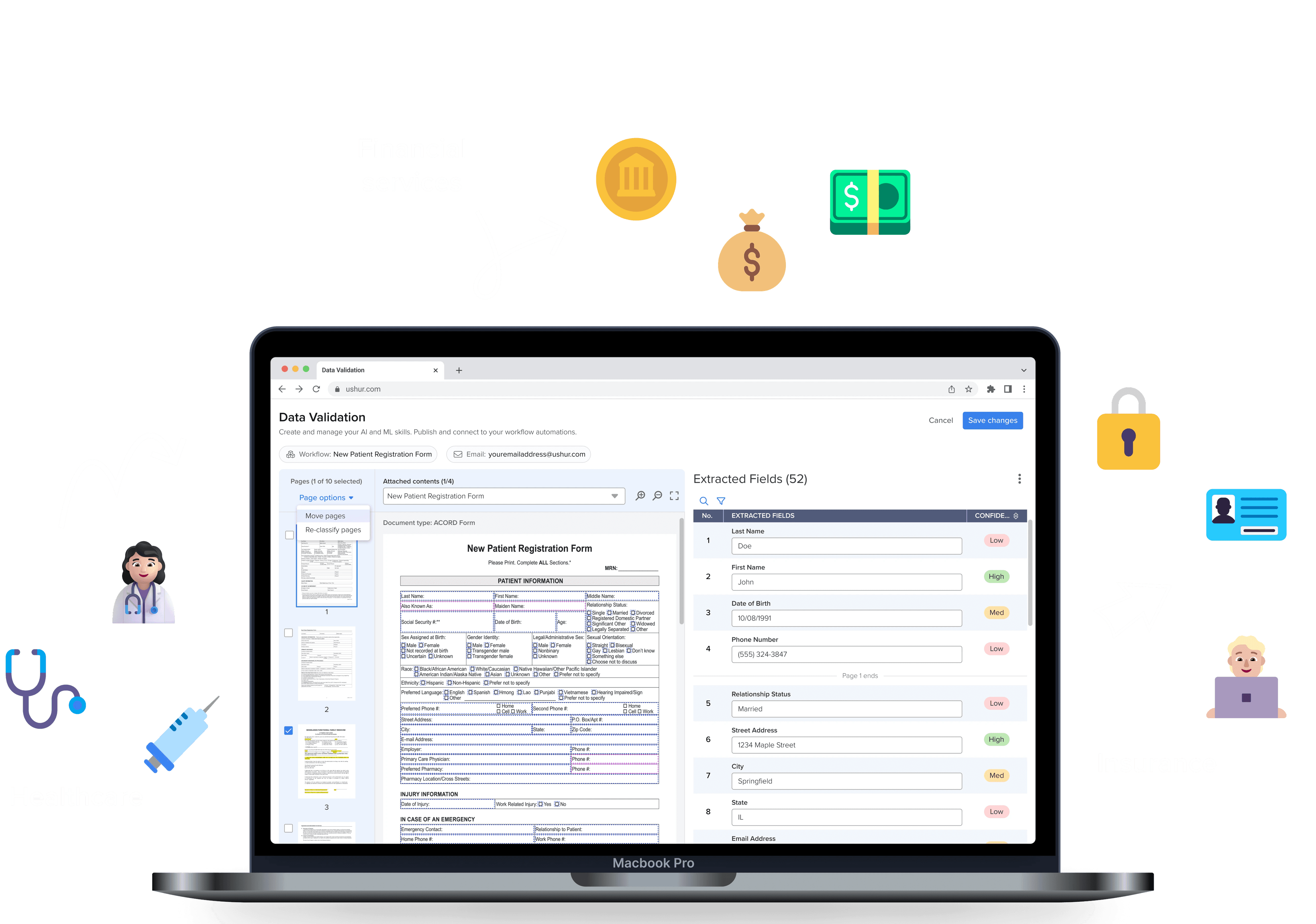
Redesigned a single-customer solution into a scalable, adaptable framework for broader customer use
Product team expects a 30% reduction in time completing user task with the new design
HIGHLIGHTS
Simplifying the Data Validation Workflow by Sorting, Editing, and
Re-classifying
CONTEXT
What is Human-in-the-loop (HITL)
in AI?
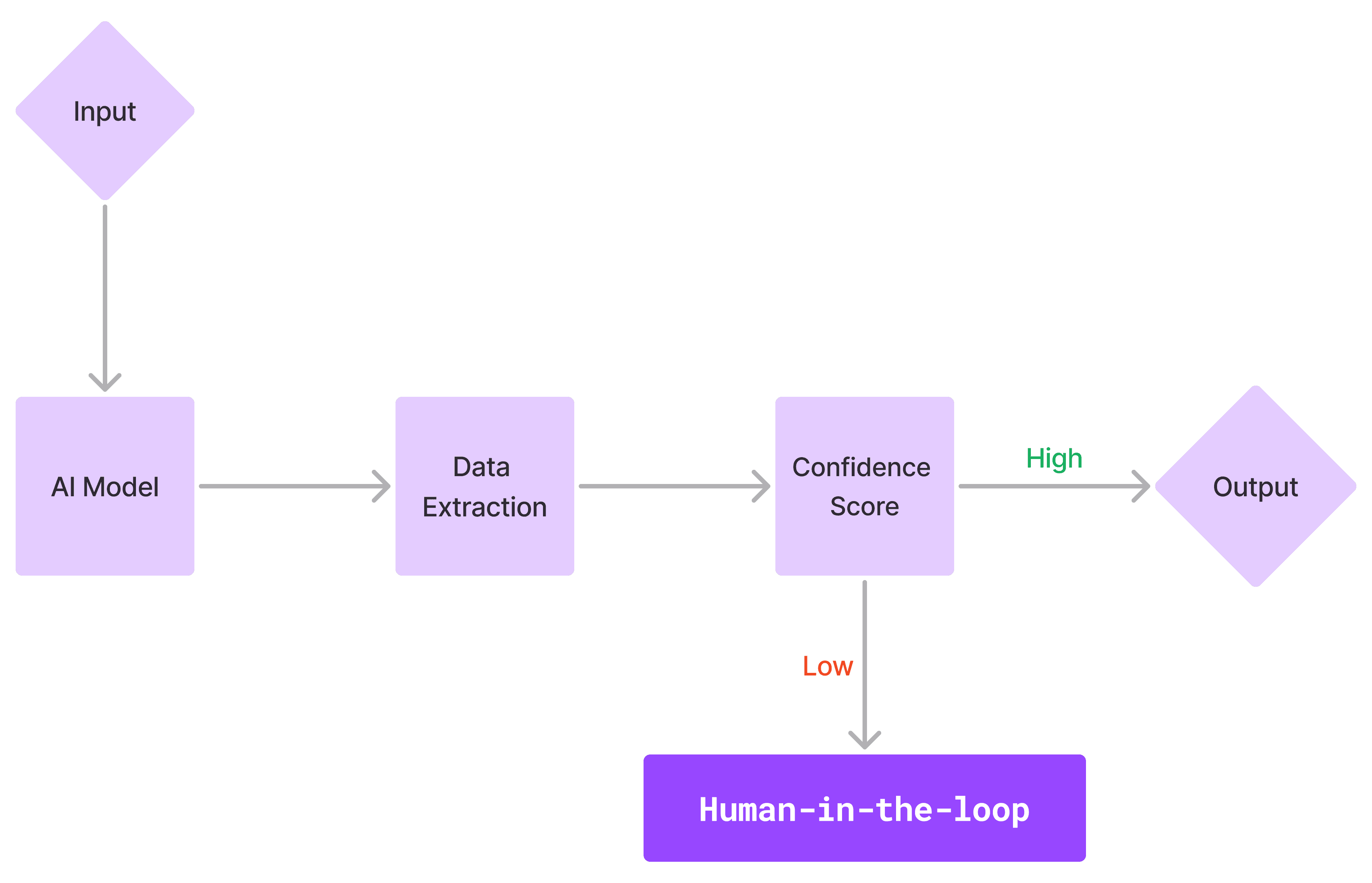
Human-in-the-Loop (HITL) refers to systems where the technology handles data extraction, while humans step in to give direct feedback on AI model, especially when the accuracy falls below a set threshold.
PROBLEM
Ushur's AI tool was slowing down the customer workflow
What are the issues?
Limited editing capabilities
Inefficient to handle large-scale data
Low scalability as it was exclusively made for a single insurance company
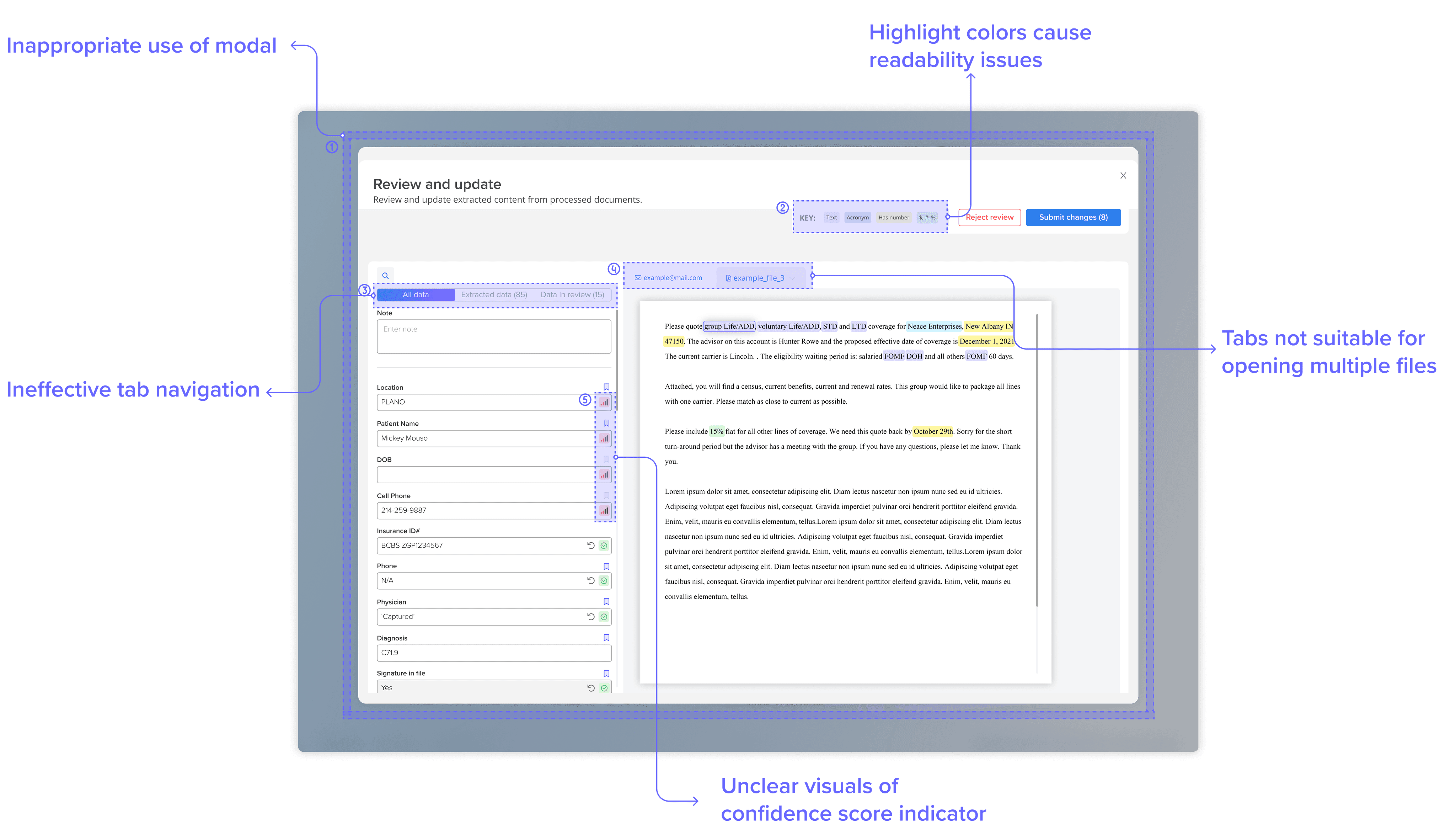
Images of the old design
How I turned issues into opportunities
Incorporate key features that enhance the user experience during data validation tasks
Streamline the workflow to improve customer efficiency when handling complex data sets
Design with flexibility to accommodate a diverse range of customers
How might we design a tool with an intuitive and efficient workflow that can expand to serve a wide customer base?
RESEARCH
Identifying target users
Industries such as insurance, financial services, and healthcare, which require efficient large-scale data validation using AI, as well as internal users at Ushur (e.g., Technical Consultants).
Customer insights & requests:
Inefficient user flow
Customer frustration with the inefficiency of identifying and correcting errors
UI difficult to navigate
The interface difficult to navigate when dealing with large volumes of data.
Need for a re-classification feature
Addition of a re-classification feature, which would allow them to reclassify document.
Conducting a usability audit
Inappropriate use of modal
A modal isn’t suitable here, as modals are best for brief tasks. For primary tasks involving complex datasets, a dedicated page is more appropriate, offering ample space for in-depth work.
Highlight colors cause readibility issues
Highlight colors on the bounding boxes can obscure the text, rendering it illegible.
Ineffective tab navigation
The tabs aim to help users navigate filtered content, but the current filtering system is ineffective and doesn't support users in completing their tasks.
Tabs not suitable for opening multiple files
The existing tab design isn't well-suited for handling large-scale data, as it accommodates only a limited number of tabs.
Low visual impact of the confidence score indicator
Confidence scores should be visually distinct to clearly highlight which data requires human validation.
WIREFRAMES
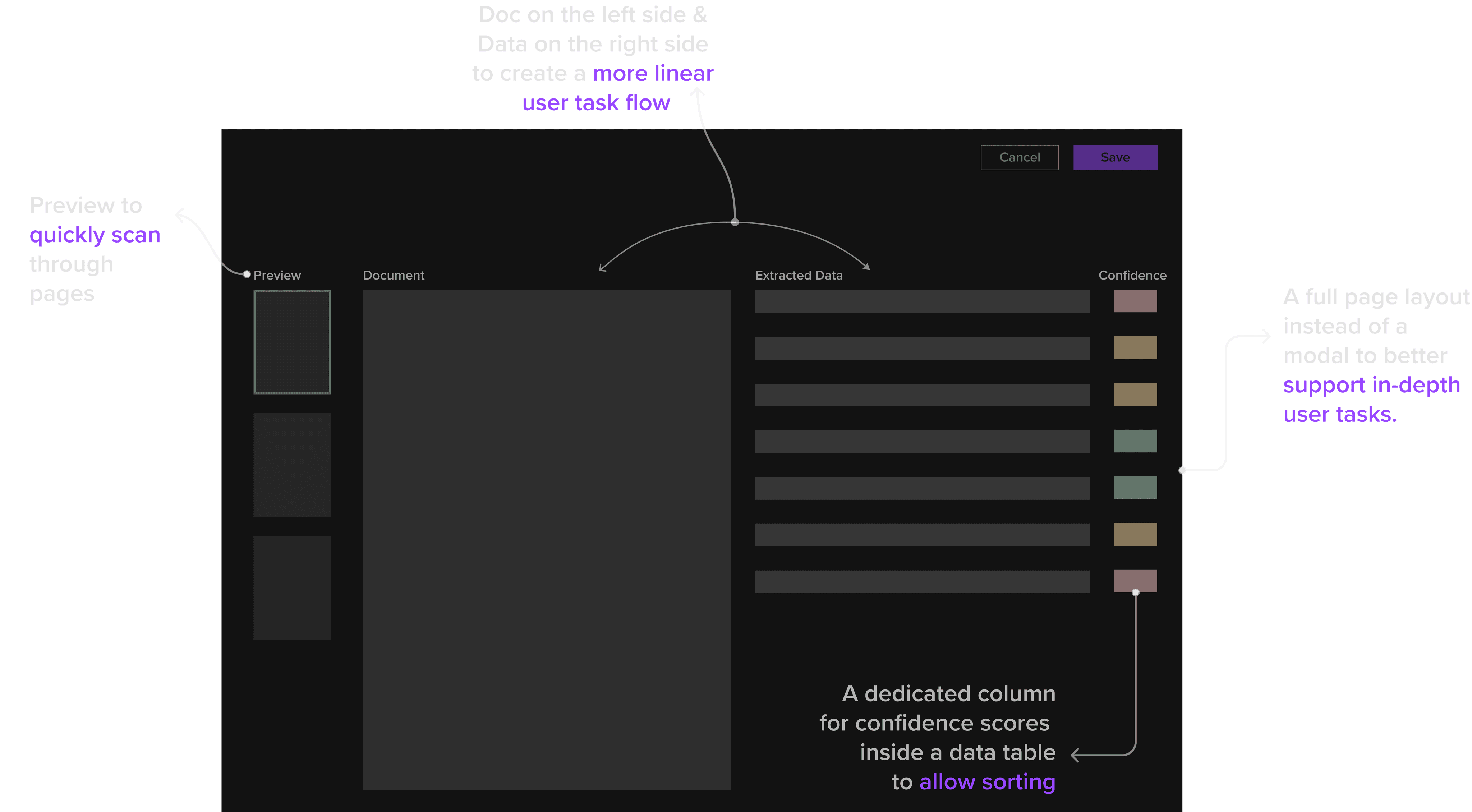
Revamping the layout with a focus on core user tasks
Leveraging insights from a usability audit and customer feedback, I redesigned the layout to kick off the design process.
REDESIGN 01 DATA TABLE INTERACTION
Enhancing data table interaction
Next, I began translating concepts into visuals using the new layout. My initial priority was to create a seamless user interaction for the data table where the primary user task takes place.
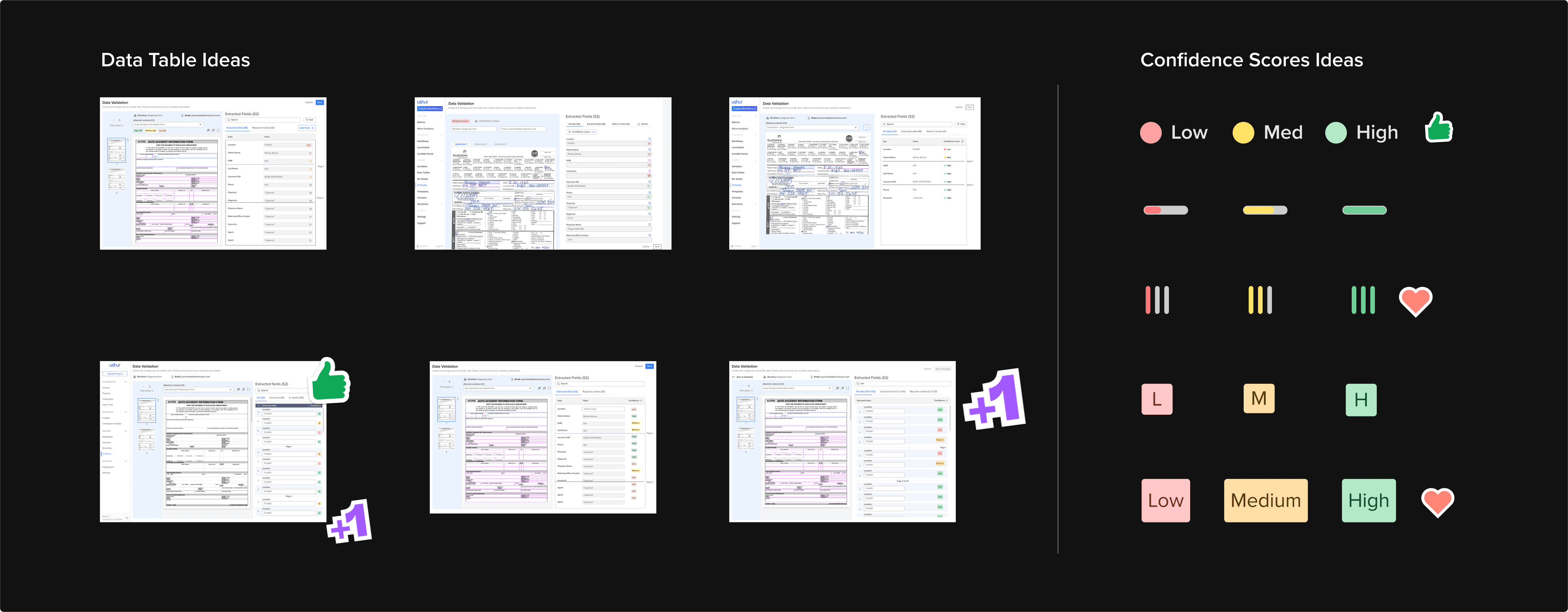
I developed multiple design directions and presented them for a team design review.
Team Design Review on initial explorations
How I made an impact on the final design
Created a natural left-to-right workflow by positioning the document on the left and the data table on the right.
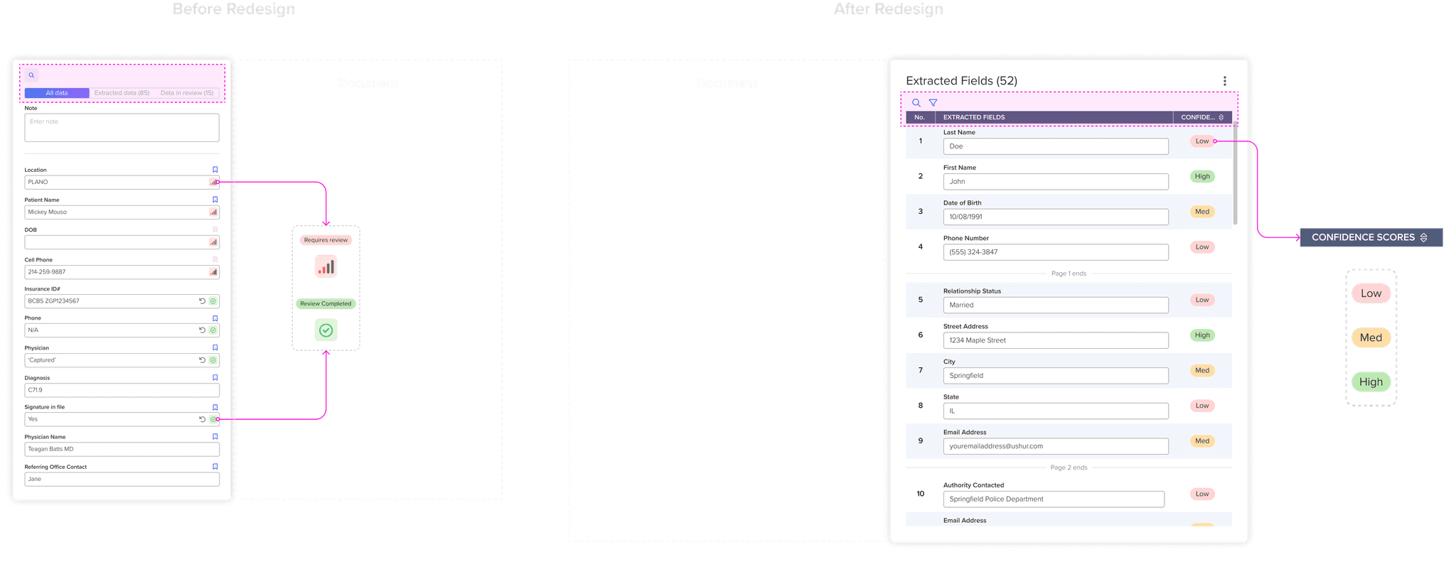
Simplified the data table header to integrate search, filter and sort features seamlessly without compromising screen real estate.
Visualized confidence scores with intuitive color-coding and categorization for enhanced clarity.
Target advantages of a confidence-based sorting feature
Prioritization of low-confidence cases
Enhancement of user transparency and trust in the AI's performance
Acceleration of improvements in AI's accuracy
REDESIGN 02 DOCUMENT LEVEL INTERACTION
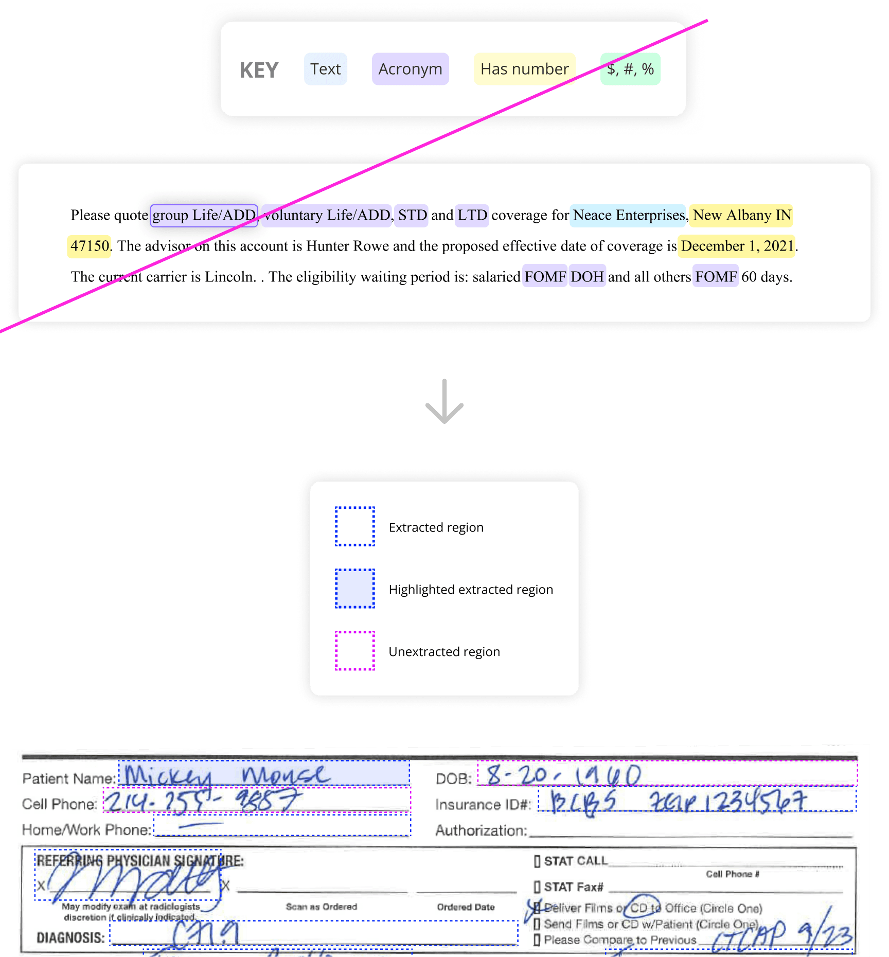
Assessing readability of extraction highlights
Customer feedback indicated that some highlighted regions were difficult to read due to the bounding box colors.
In response, I redesigned the bounding boxes to enhance data extraction visibility while preserving text legibility.
Highlighting the corresponding region when hovering over the data
REDESIGN 03 NEW FEATURE LAUNCH
Implementing a new feature: Document Reclassification
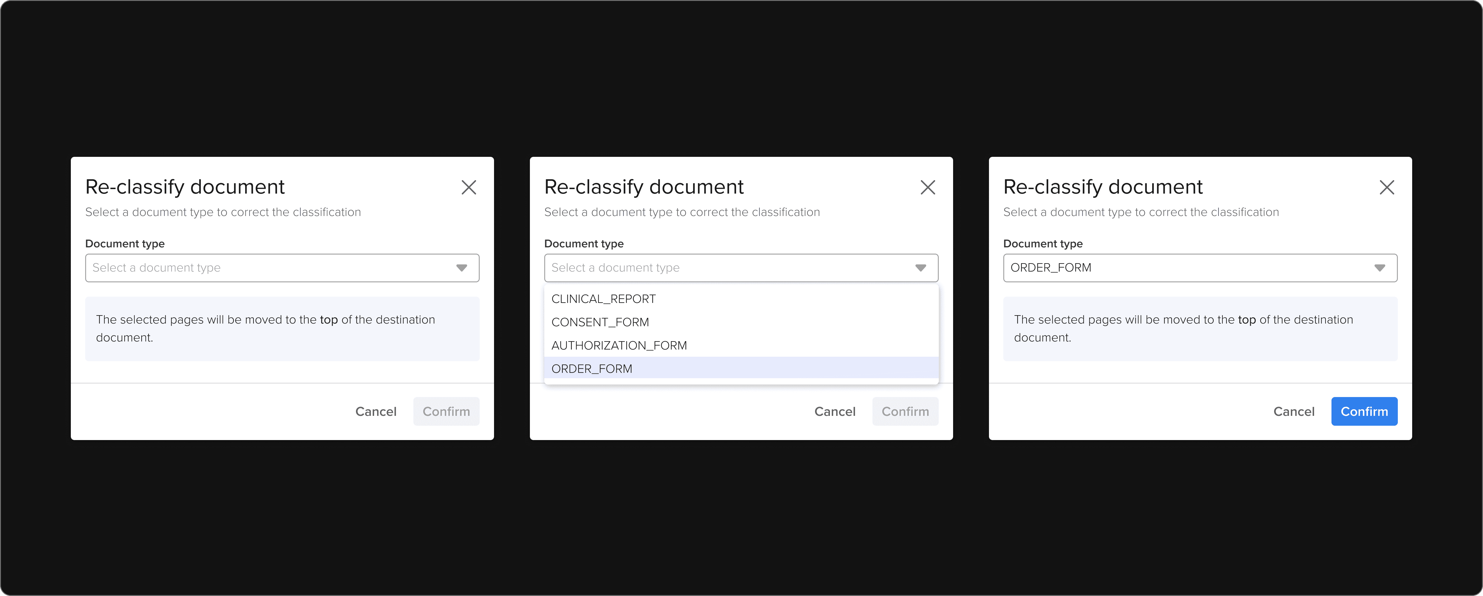
Reclassification enables users to update the classification of documents in HITL, correcting any instances of misclassification.
For example, the user views a document classified as CLINICAL_REPORT and determines that document should be classified as ORDER_FORM.
Drawing user attention with modal design
For brief yet important tasks like this, modals are widely used across the platform. I implemented a modal for document reclassification to focus the user's attention on this key task.
