Centralizing collaboration and iteration for an industrial design software
mfg.parts - Industrial Design Software
My Role
Lead Designer - Interaction Design, Visual Design, Usability Testing, Prototyping
Team
Joel Dodich, PM
Suvamsh Shivaprasad, Engineer
Keegan Bond, Engineer
Timeline
6 weeks, Launched in Sep 2023
Overview
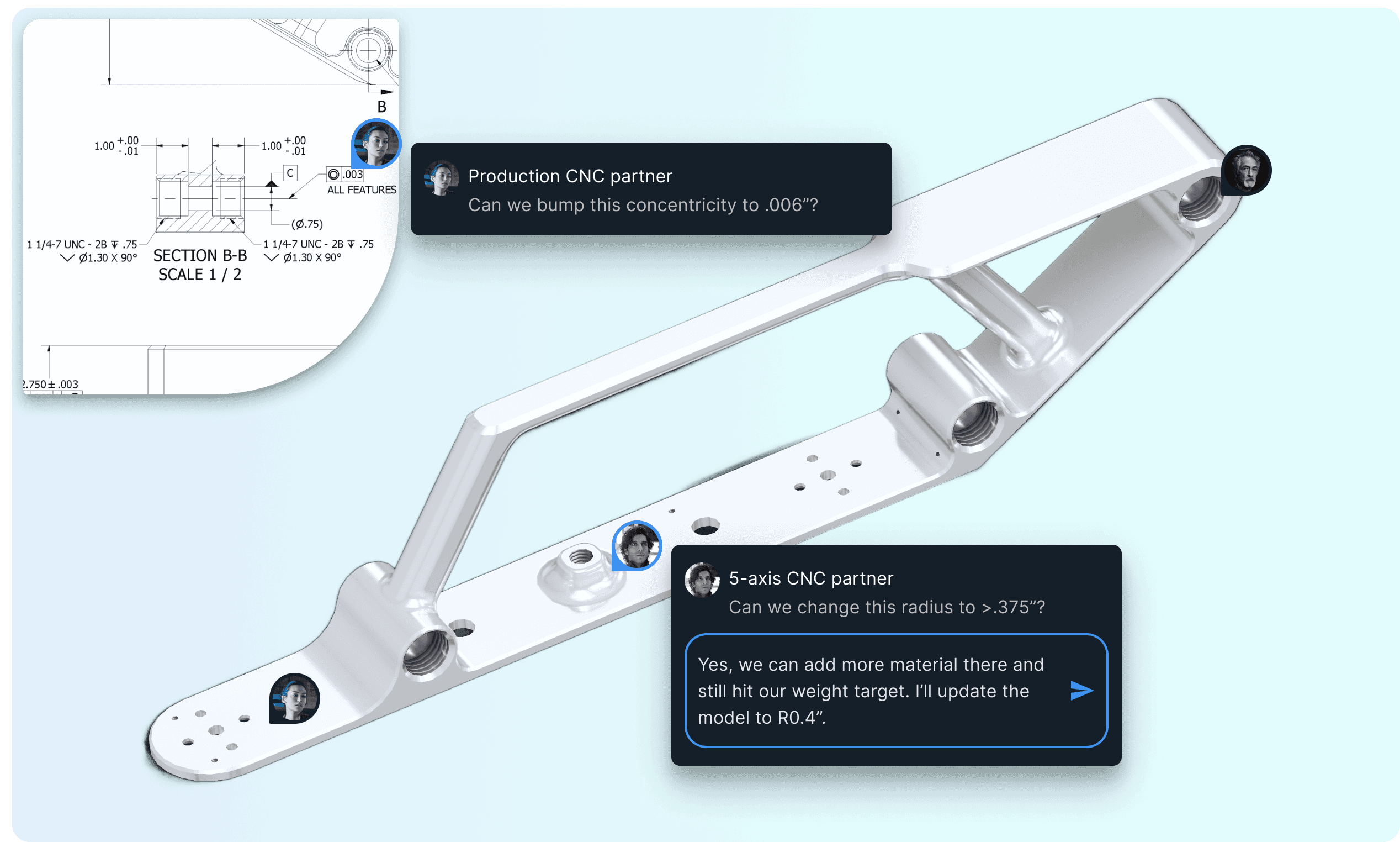
mfg.parts is a web app for engineers and their manufacturing partners to collaborate and iterate on industrial designs.
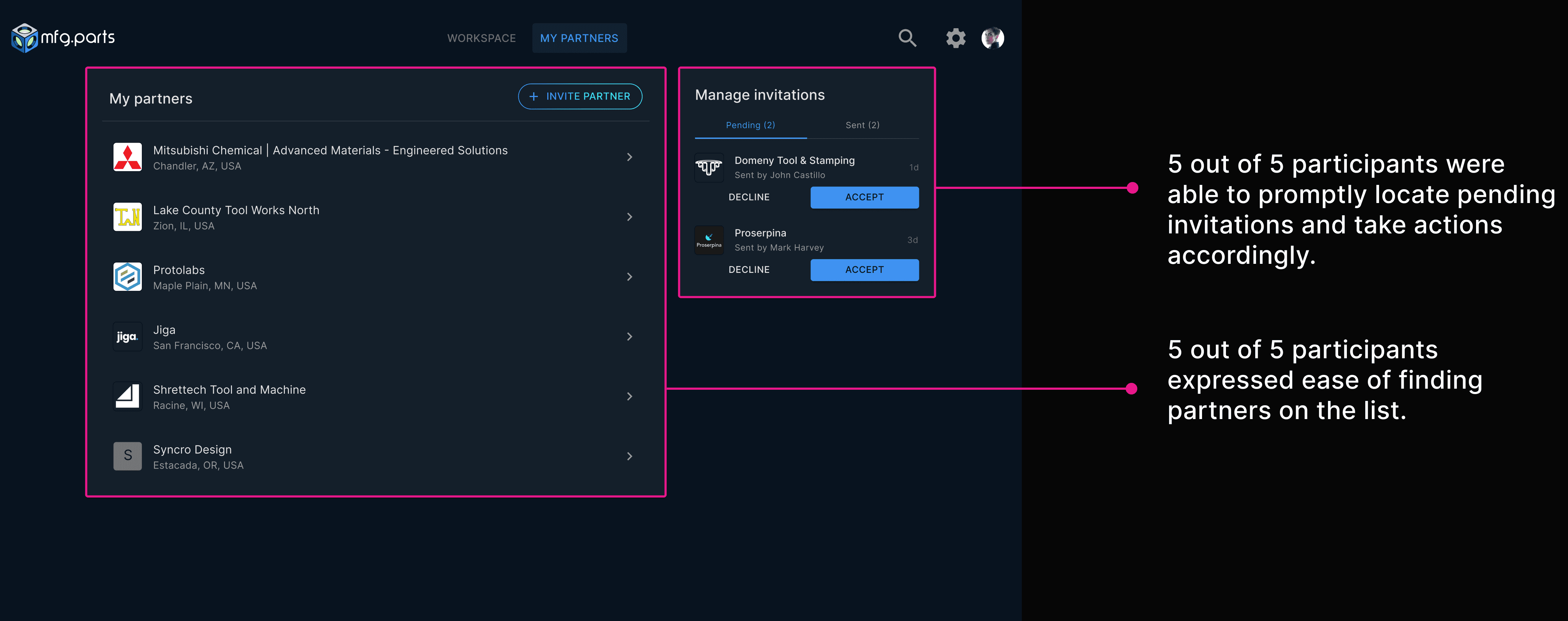
I owned and designed the 'My partners' page. On this page, engineers can invite manufacturing partners, manage invitations, and access partner information.
The initial beta version of the product, serving as an MVP, was launched in Sep 2023 and successfully helped secure the initial funding.
Highlights
Problem
mfg.parts is designed to be a collaborative hub, but the MVP lacks a feature to invite users to the platform.
💡 How might we empower users to invite their partners to the platform and work collaboratively?
Product Ideation
Identifying product requirements for the MVP
01
Create a designated page for partners
Create a separate landing page for displaying a holistic view of partners
02
Invite partners / manage invitations
Create a new user flow to invite partners and manage invitations
03
View partner organization page
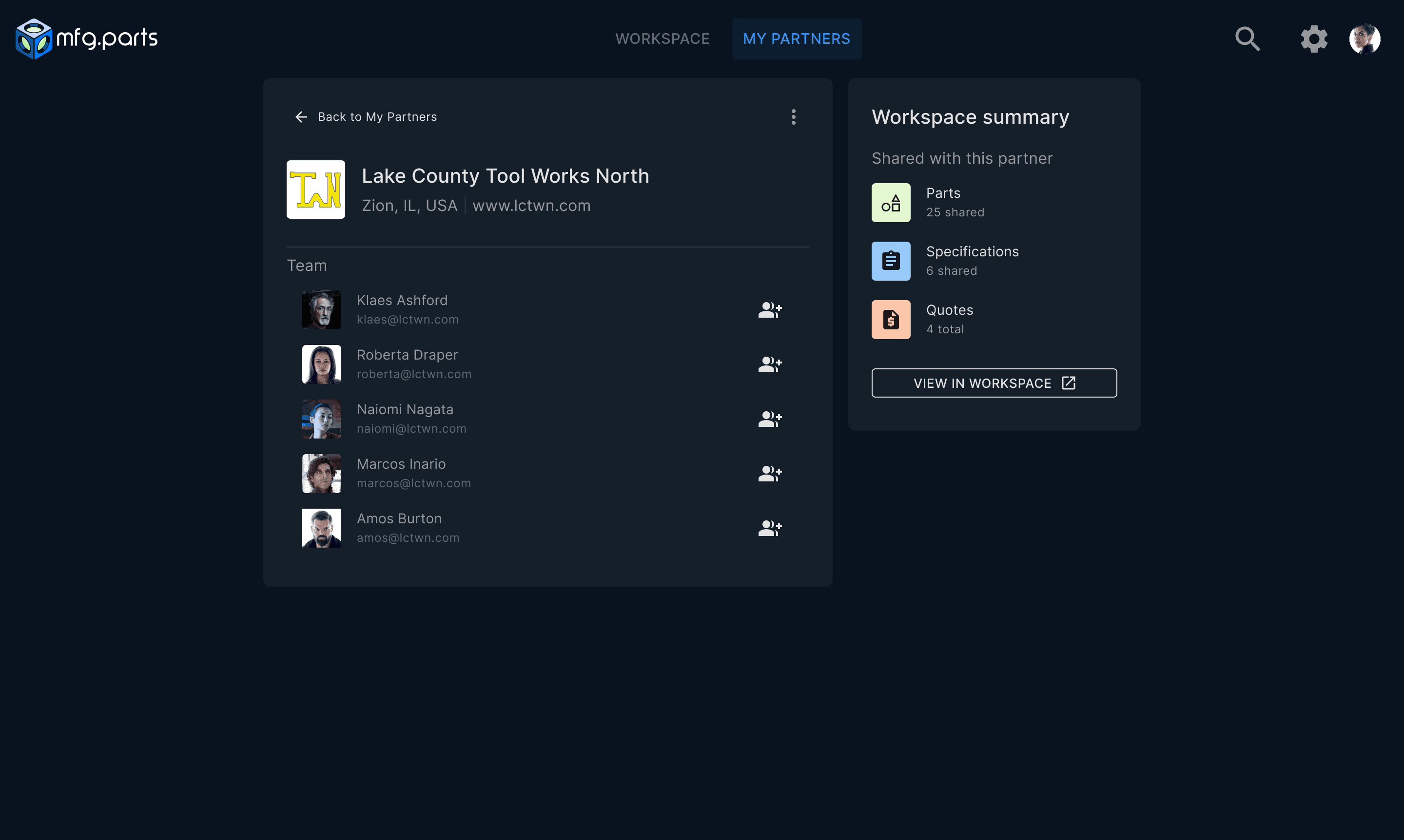
Create an individual partner page and access information such as who’s on the team and what files are shared
01 Create 'My partners' page
Defining core functionalities and exploring layouts
A primary CTA to invite partners to the platform
A feature for users to accept or decline invitations
List of existing partners
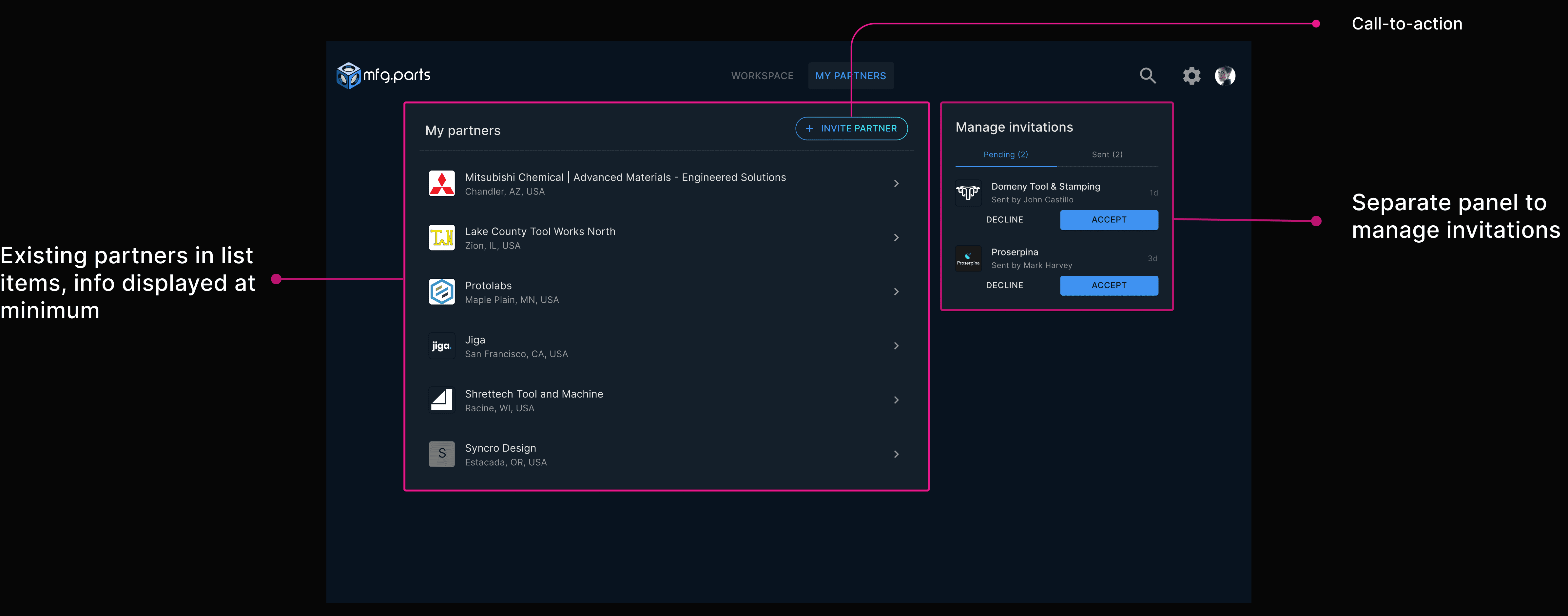
Small Card
Partner info displayed at minimum
Invitations filtered by status
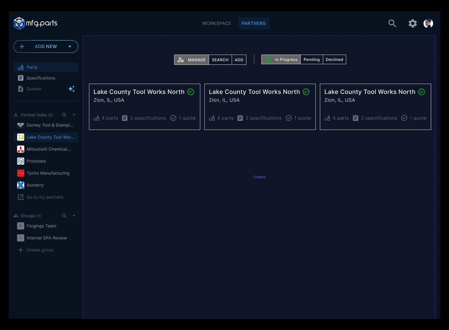
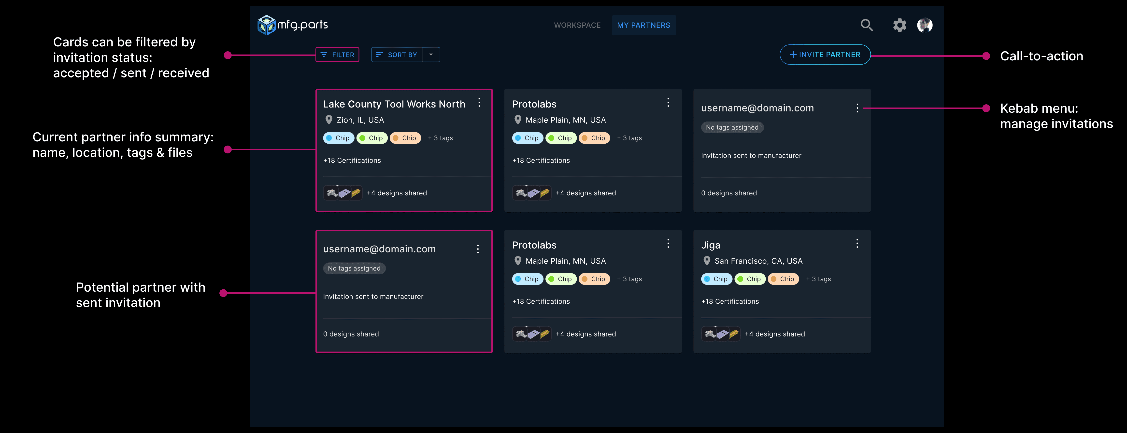
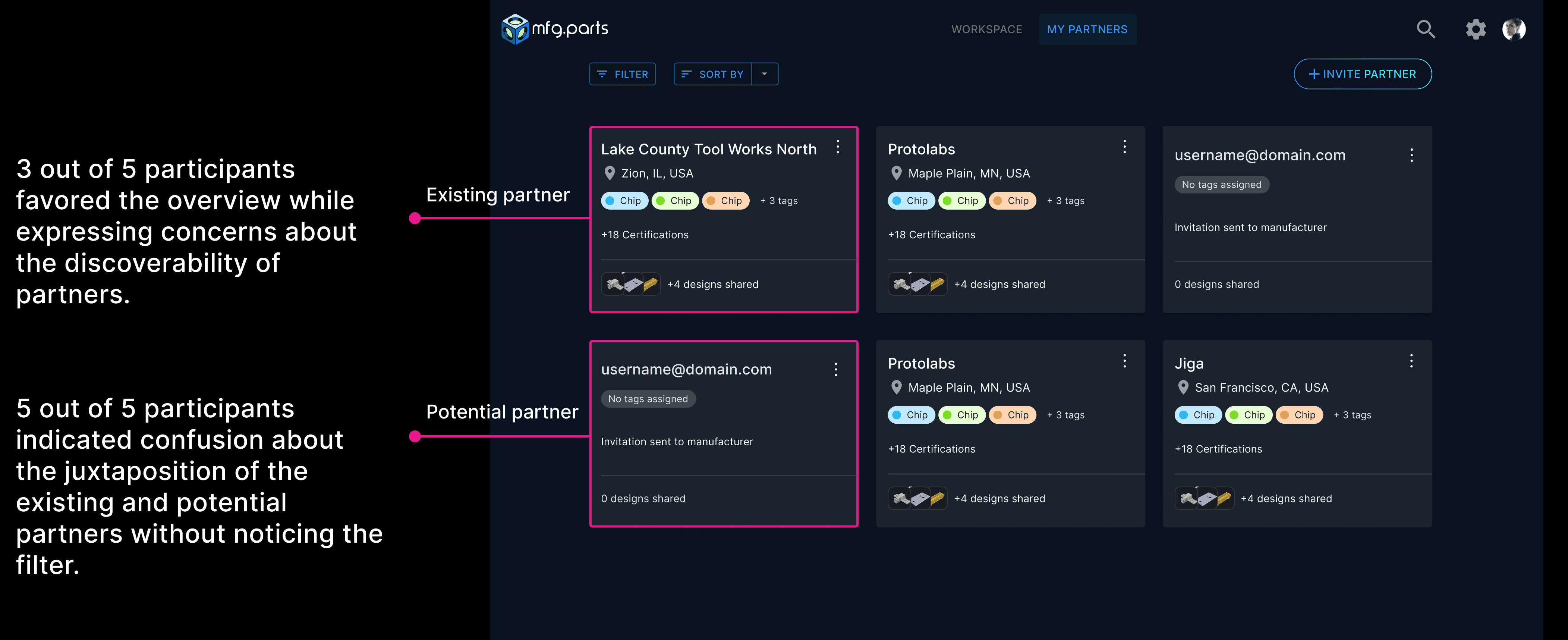
Medium Card
Partner info displayed in details
Invitations filtered by status
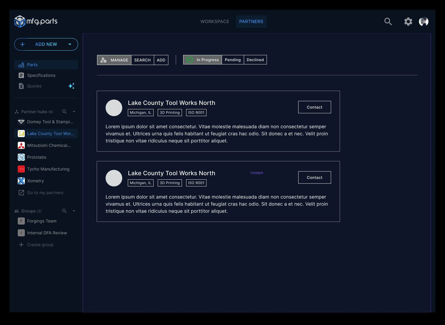
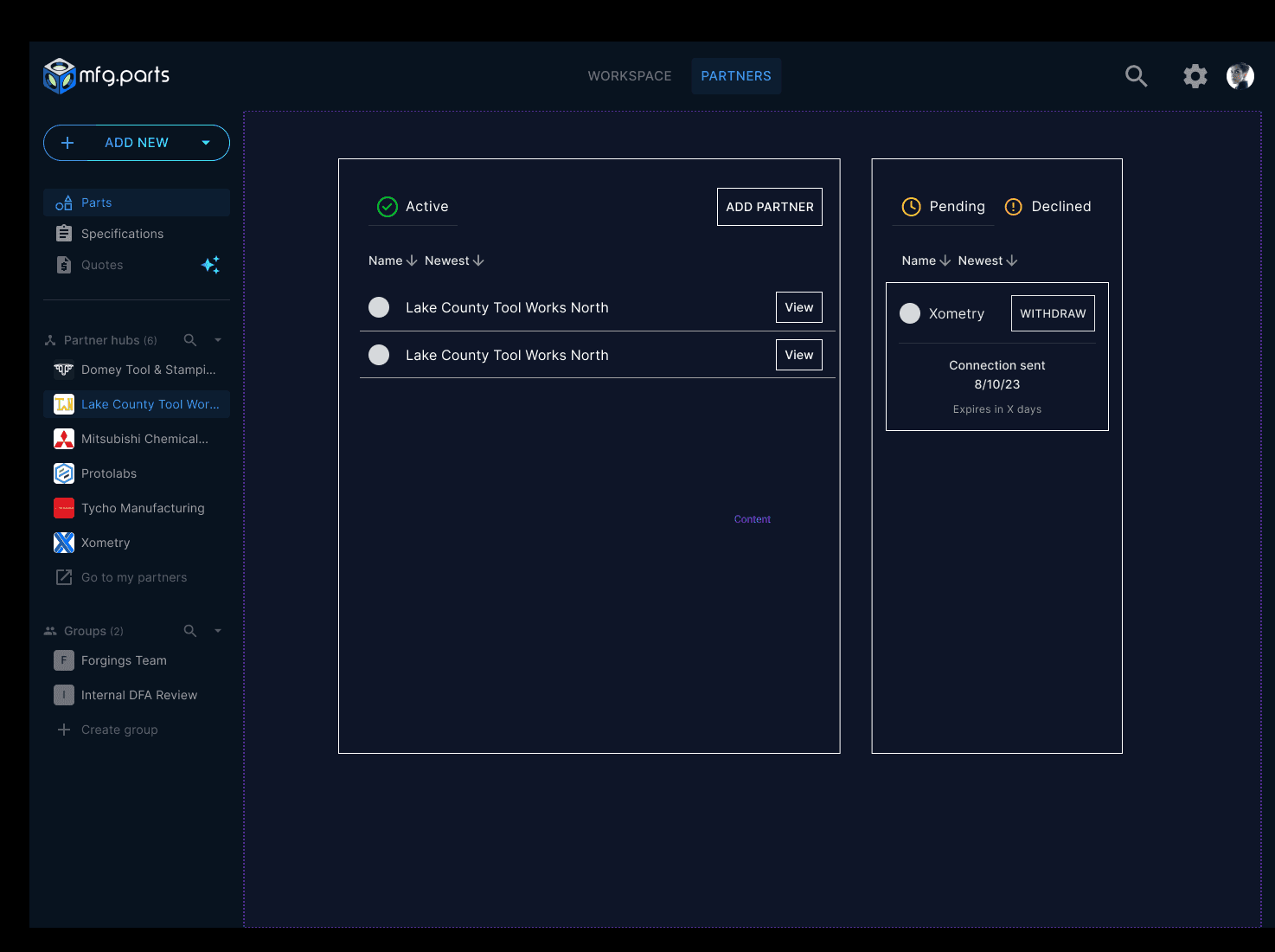
Large Module
Partners' list items on the left side
Invitation manageable on the right side
Feedback from stakeholders
Based on the feedback to stick to the existing design patterns, the small card layout was ruled out.
01
Maintain a similar design pattern to the existing one
To minimize the engineering efforts, I agreed to follow the existing design
02
Apply macro and micro emphasis
Prioritize invitation management in terms of user action as it's time-sensitive and de-emphasize the partner list
03
Add a touchpoint to access the individual partner page
Users would be able to go to a dedicated partner page from the partner list
With the two remaining design directions, Then I proceeded with creating high-fidelity mockups to provide more design context and analyzed pros and cons of each design direction.
Then I proceeded with creating high-fidelity mockups and decided to A/B test between the medium card design and large container design.
02 Invite partners / Manage invitations
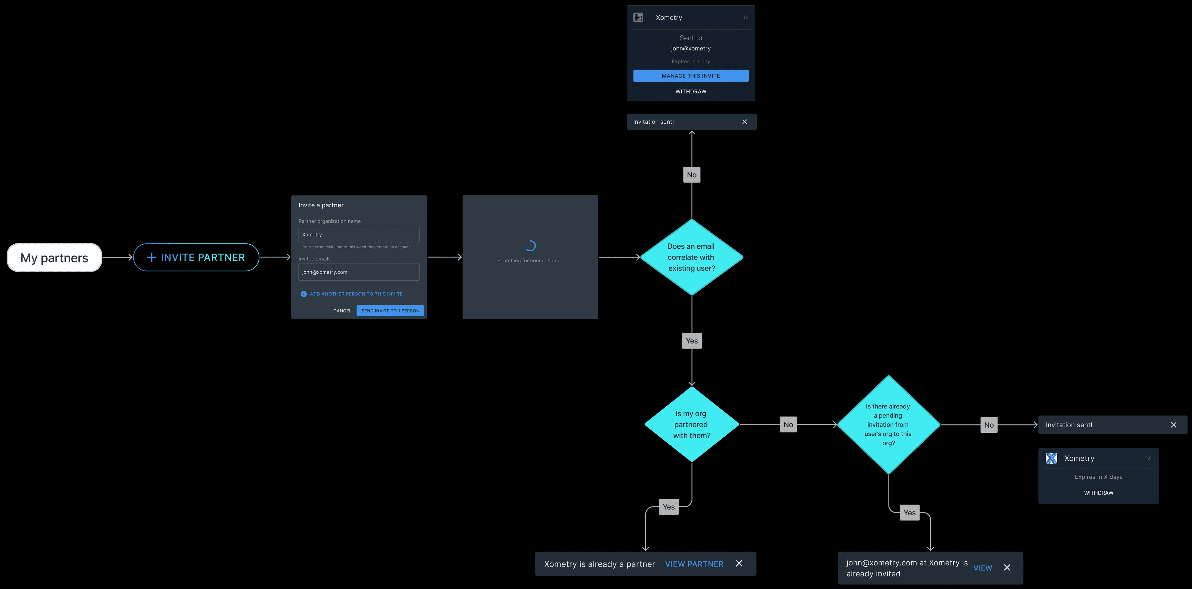
Invite a partner user flow
Prototyping the Happy Path
Collaborating with engineers to identify edge cases in partner invitation flow
We were able to identify unpredictable scenarios in this flow and designed for edge cases
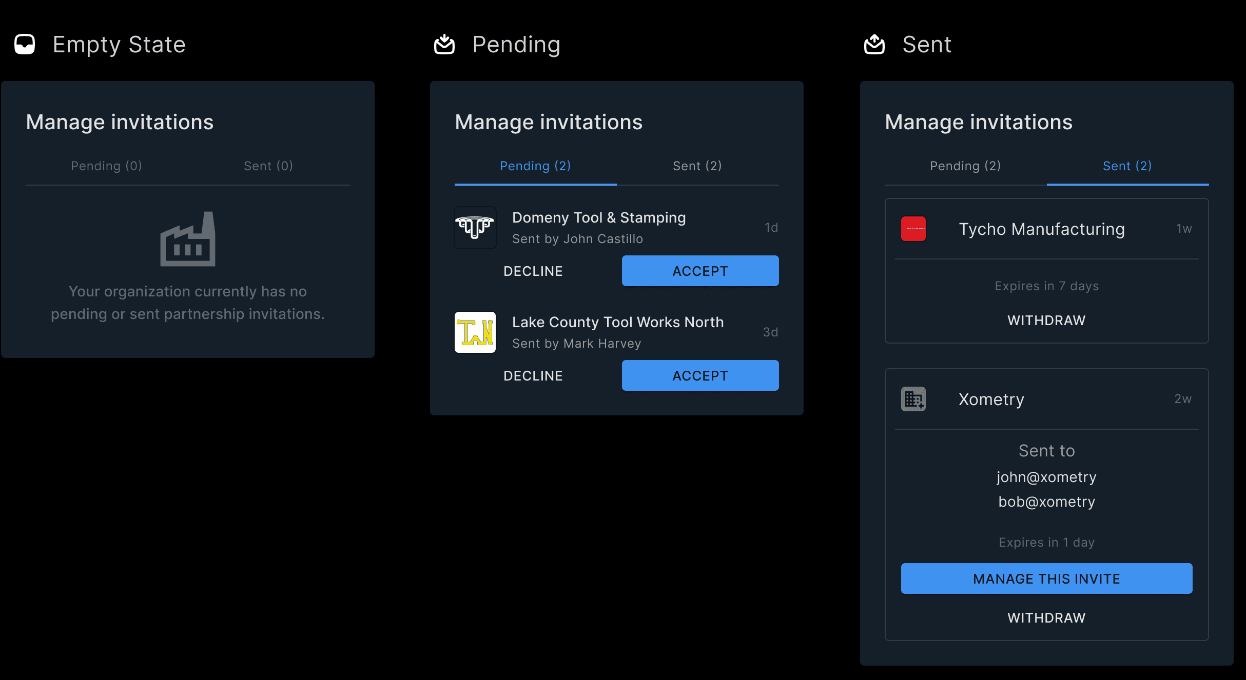
Building a component library that consists of different invitation status
Building a component library helped us accelerate development by reducing the need to create UI elements from scratch.
03 Access the individual partner page
Following the large container design for My partners page, I then designed an individual partner page where users can view a summary of their partner's details, such as team members and shared information.
Final Design - Core user flows
Users can now invite a new partner, view existing partners' page and manage invitations in the first MVP.
Project Impact
Pitched at Tech Week 2023 and successfully raised the 1st round of funding
My Takeaways
Aligning the business objectives with user needs was challenging without any prior knowledge but I learned to navigate the ambiguity using product thinking skills and validating ideas with stakeholders.
Maintaining and evolving component libraries helped our team accelerate the development process and ensured consistency.
