Redesigning the User Onboarding Experience for a no-chat Dating App
Skip - Summer Internship 2023
My Role
Lead Designer - Interaction Design, Visual Design, Usability Testing, Product Strategy
Team
Scott Avy, PM
Zach Barnes, Engineer
Kyo Kim, Product Designer
Timeline
4 weeks, Launched in July 2023
Overview
Skip is a chat-free dating app that beta-tested in Austin, Texas in 2023 and launched nationwide in Jan 2024.
In 2023, Skip faced a significant challenge: ~50% of its users were not completing the onboarding process. This led to low-quality profiles and, consequently, low match rates.
Our team embarked on a mission to understand the reasons behind user attrition and set a goal to enhance the user onboarding experience, aiming to achieve a completion rate of 60% to meet our KPI.
Highlights
Highlights
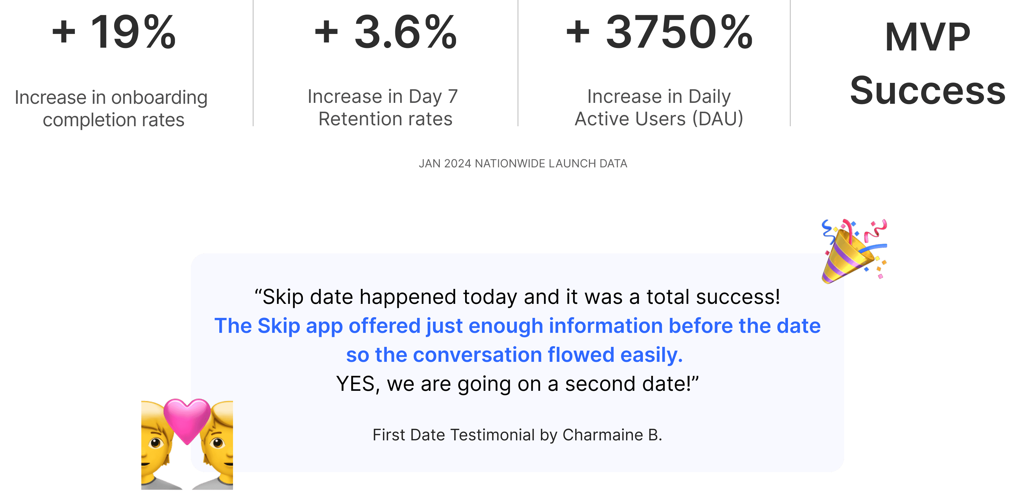
Positive Impact on Key Business Metrics
My contribution as a product designer
Impact
Context
Why onboarding matters to Skip
🤯 User Perspective
Incomplete onboarding may lead to challenges in matching, as there might be limited information available on the profile page, potentially affecting the overall dating experience negatively.
📉 Company Perspective
Low match rates can lead to user frustration and disengagement, ultimately threatening the long-term viability of the product in the competitive market.
User Research
Who are the users?
Understanding user pain points in online dating
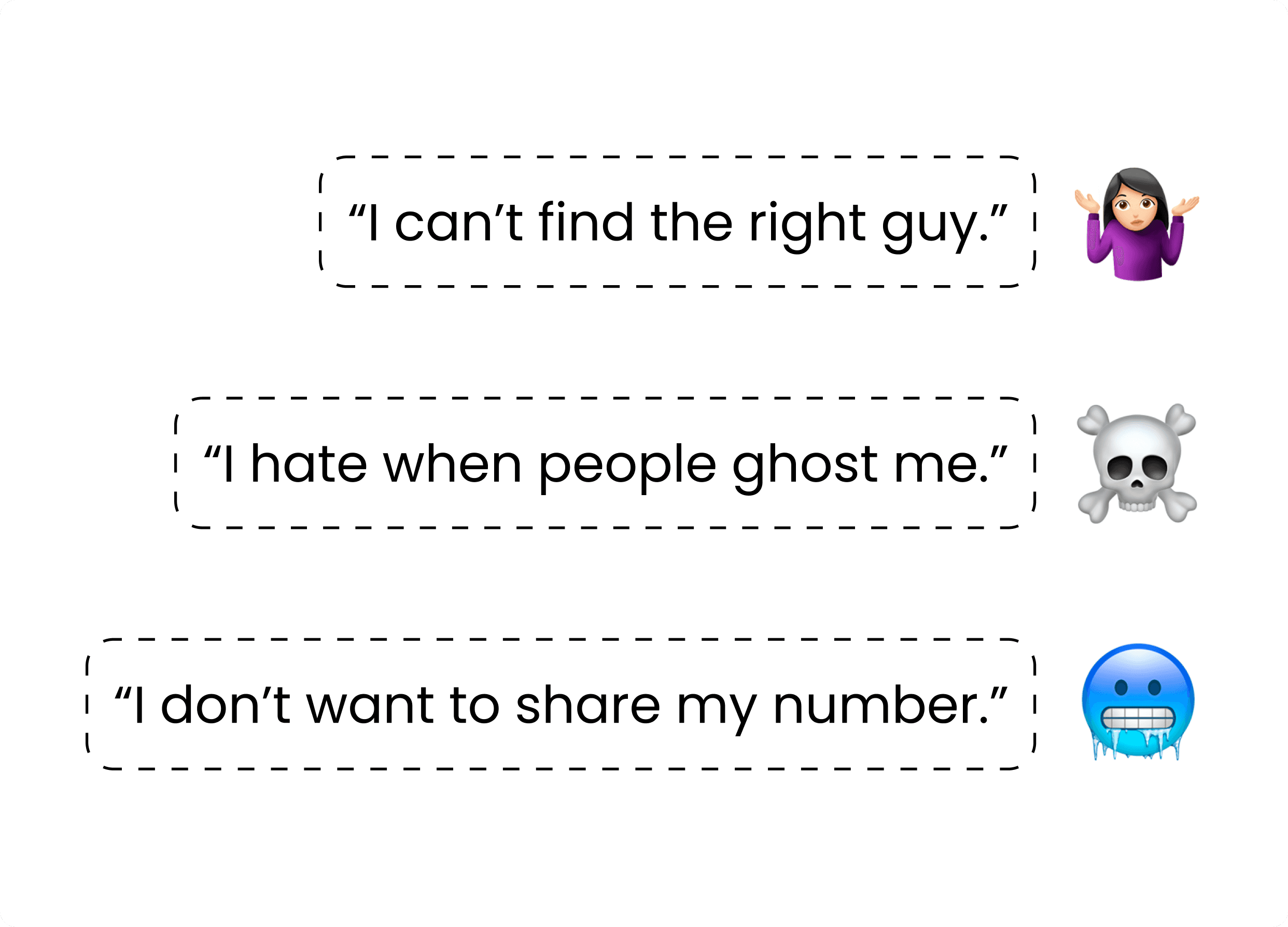
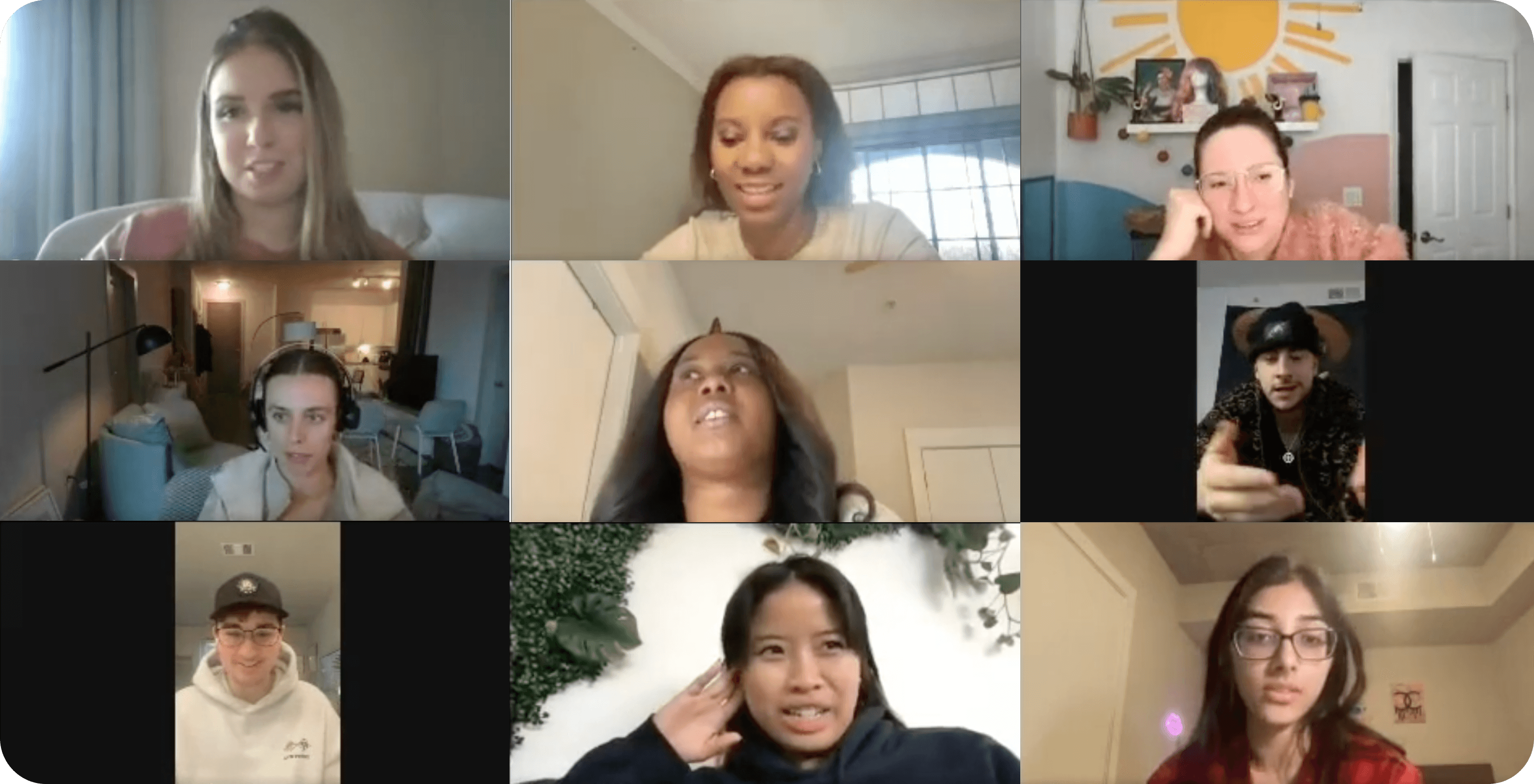
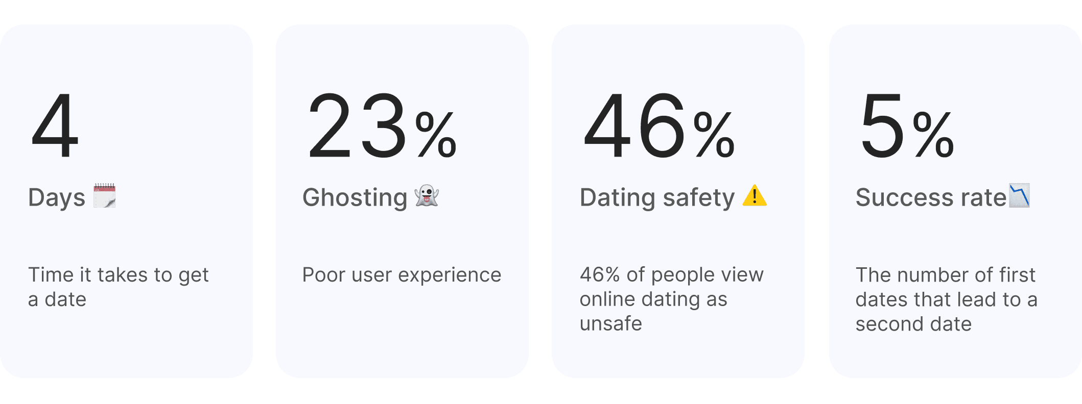
Our team conducted surveys and interviews with 115 individuals who have used dating apps in the past 12 months. From the raw data, we identified 4 primary user pain points as below.
User Pain Points
Synthesizing insights & making assumptions on possible friction points during onboarding
During onboarding, users are not provided with Skip's value propositions.
Users are experiencing burnout from spending endless hours online.
Users are clueless about how matching works without a chat.
Challenge
It's often said the shorter the onboarding, the better…
⚠️ Each additional step in onboarding may result in a drop off.
In dating apps, the standard length of the onboarding can vary from 20 - 50 steps due to the numerous profile setup questions.
While the decision to add more steps must be made thoughtfully, certain additions are sometimes unavoidable.
My design principles to tackle the challenge
🌈
Make it as engaging as possible. If extra steps are a must, why not make them engaging?
🎁
Reward users. Show how they can benefit from completing each step.
⏭️
Make it skippable. Give users the option to skip certain steps and revisit later.
💡 How might we improve Skip user's onboarding experience?
Product Ideation
Identifying the main aspects of MVP
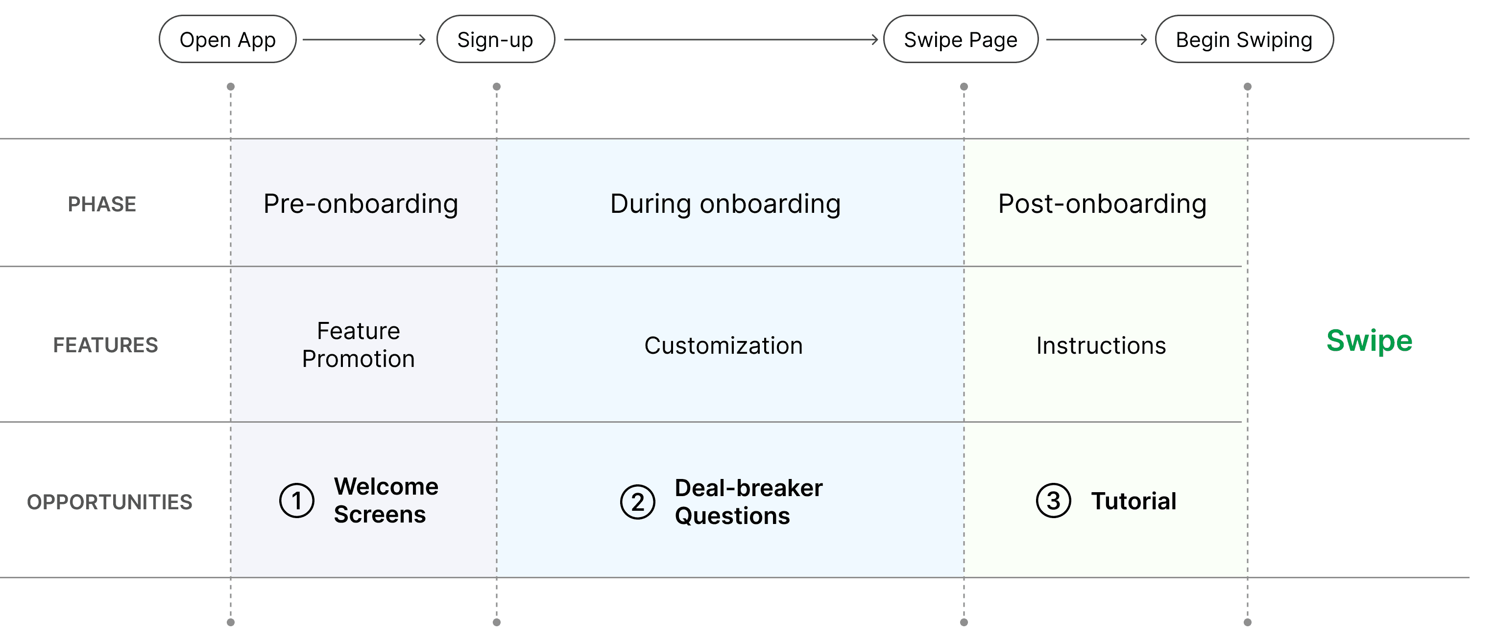
Onboarding breakdown & opportunities in each phase
Opportunity #1
Goal: visually convey Skip's benefits to users and set user expectation right from the start
Final Design
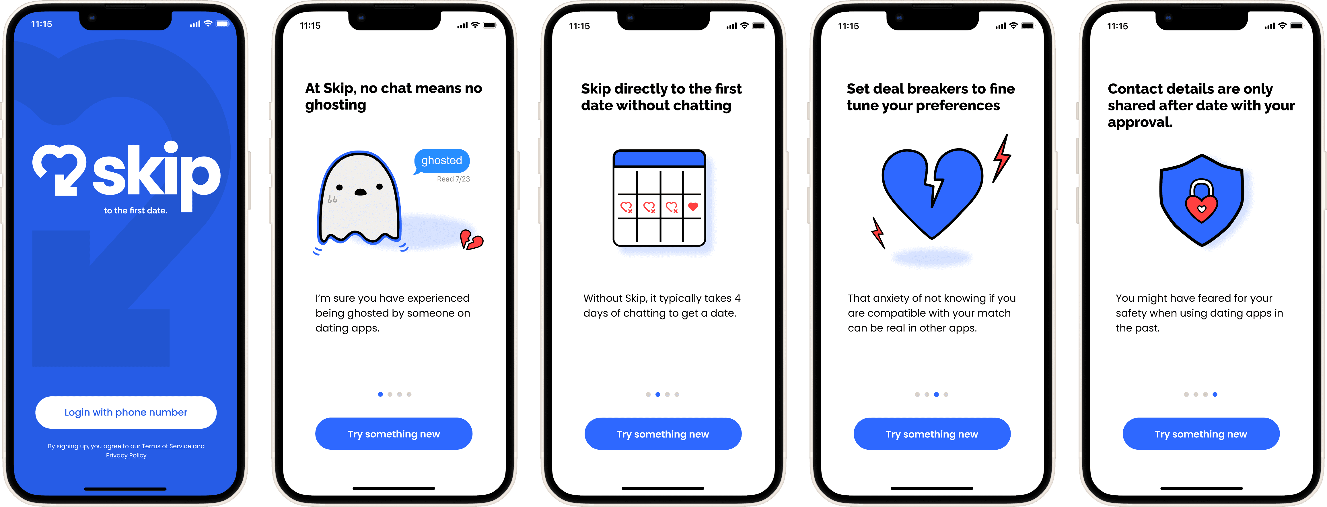
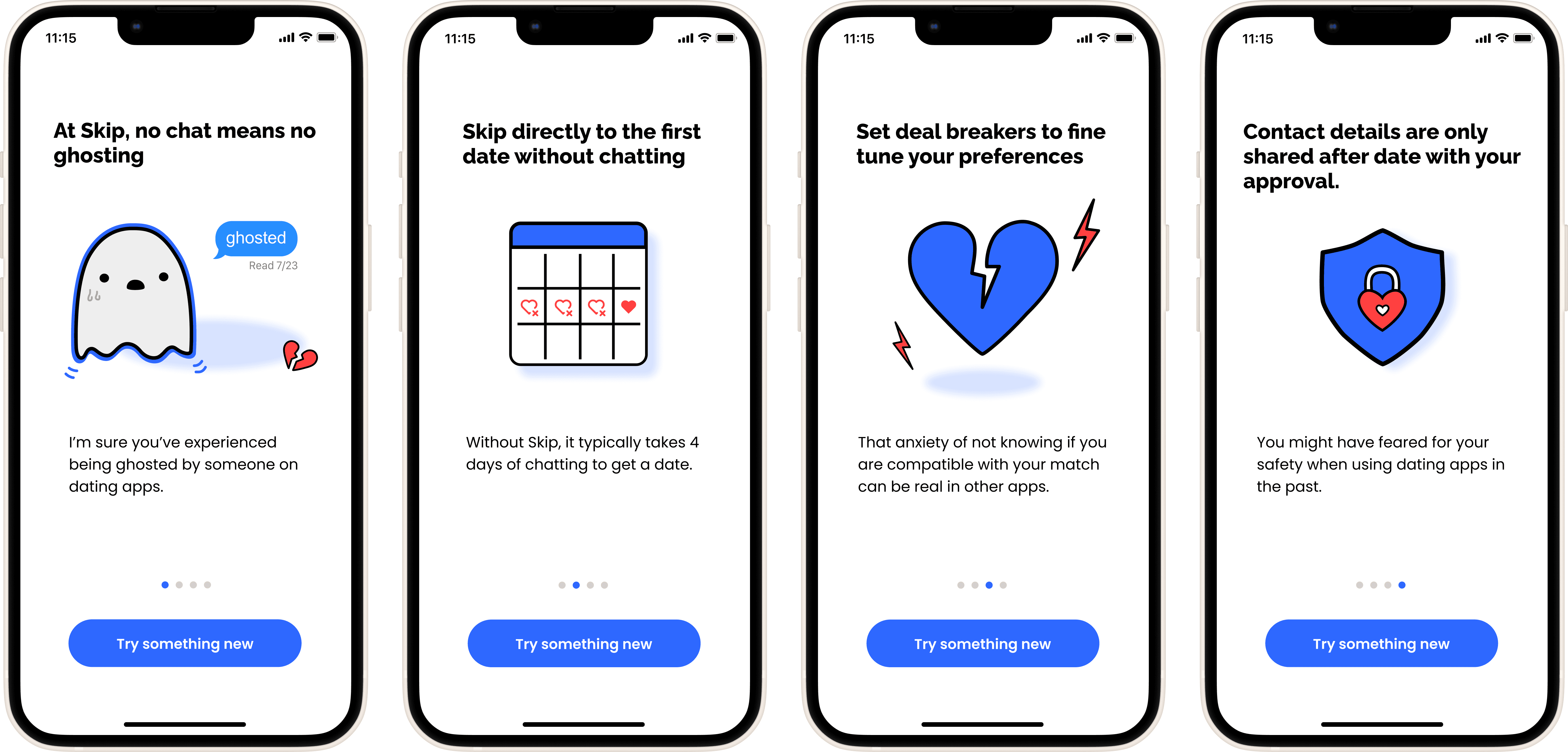
Visualized user pain points & Skip's unique solutions in welcome screens
A question to myself: With so many dating apps available in the market, why choose Skip?
To address this, I designed welcome screens that communicate Skip's core concepts from the very start. Through fun visuals and concise text, these screens aim to set user expectations before they embark on the onboarding process.
My Design Impact
Product Impact
Opportunity #2
Goal: add customization, but make it enjoyable
How might we help users spend less time online and meet qualified matches IRL?
Tying back to our users who are experiencing burnout from spending endless hours online.
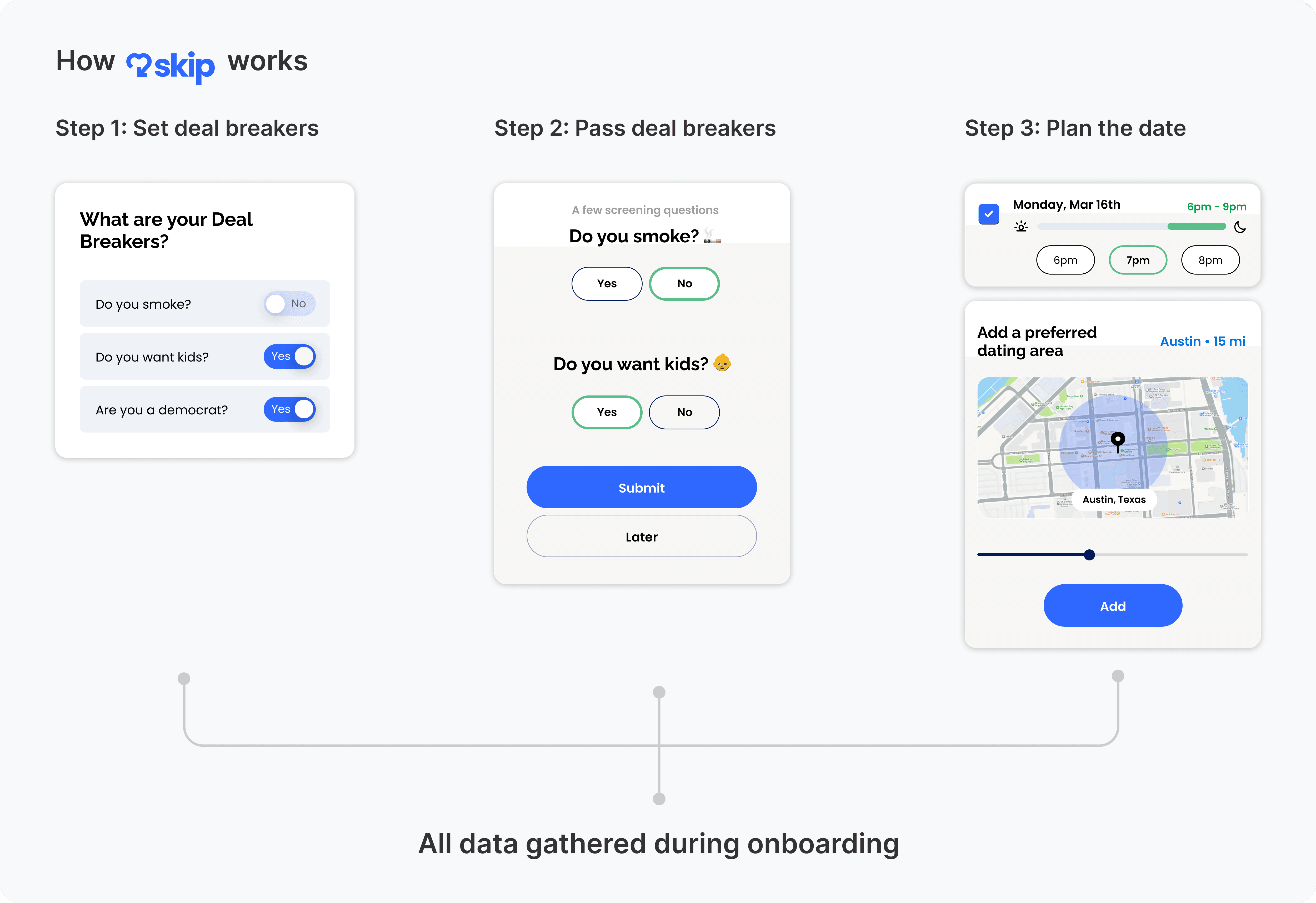
Conceptualizing how to pre-screen undesirable matches
I assumed that ruling out unqualified matches in advance could optimize users' onboarding experience and enrich their dating journey.
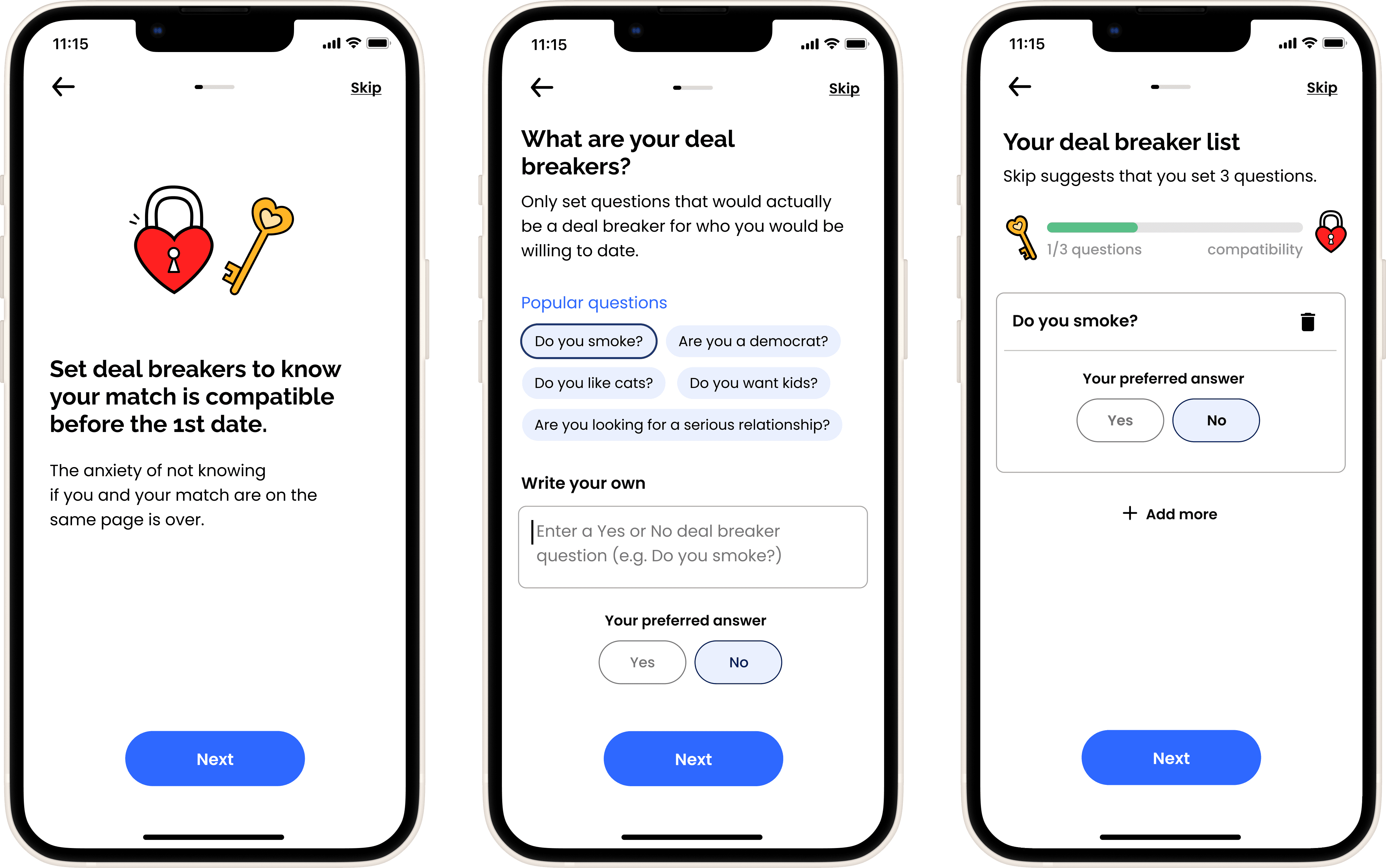
Understanding that users aim to find their ideal match in online dating, I leveraged this intrinsic motivator. I restructured lengthy onboarding questions into an enjoyable and rewarding screening mechanism.
Relationship Deal Breakers: Weed out potential bad apples
Early Stakeholder Validation
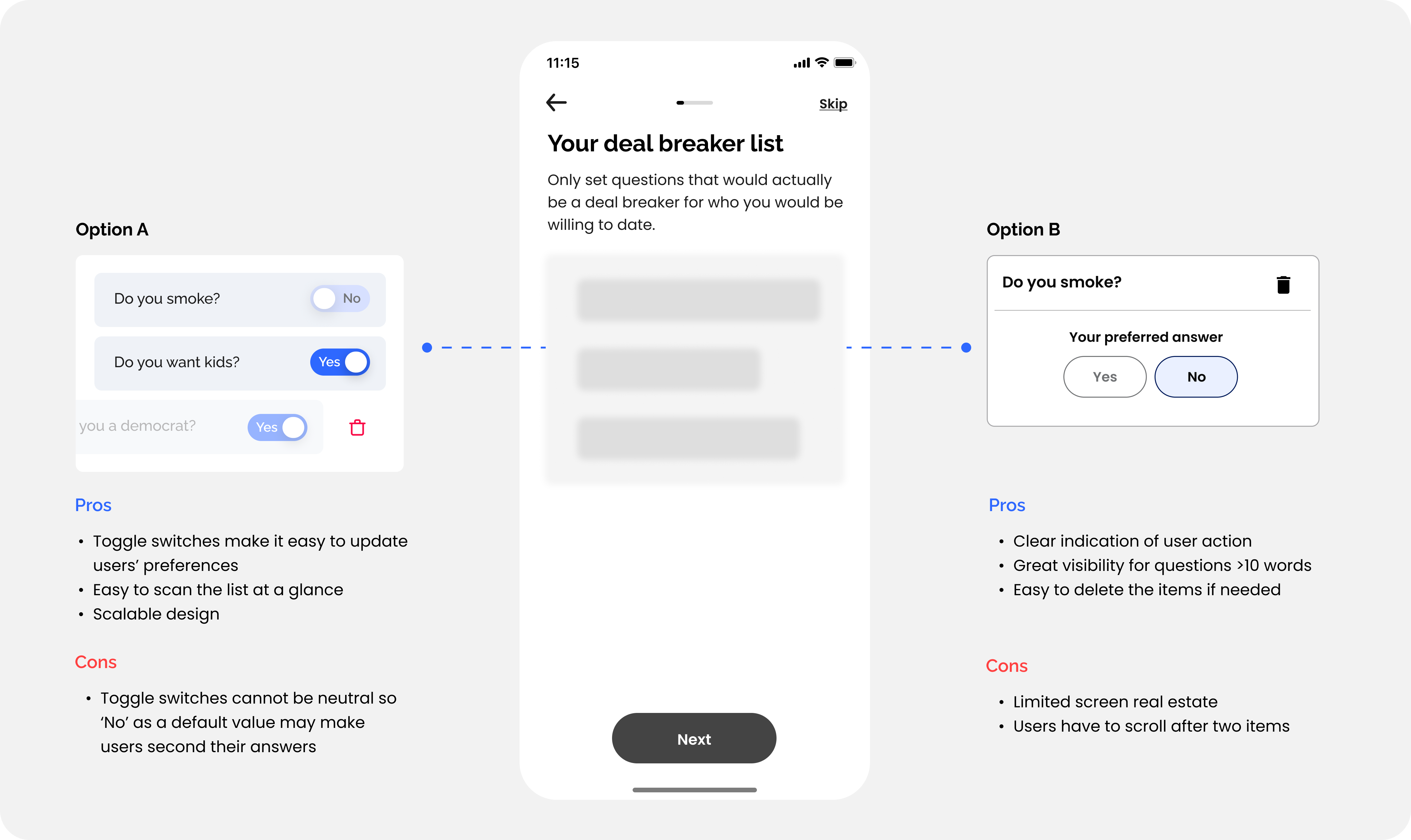
In my iterative design process, I presented stakeholders with Option A, featuring user-friendly elements like toggle switches and scalability for extensive lists.
Balancing scalability and user needs
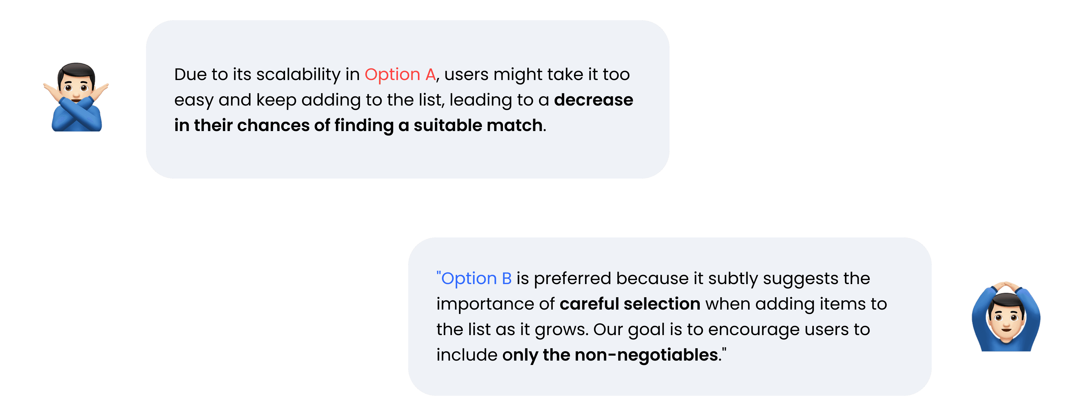
Feedback on Option A: Scalable design but not the right solution for our user needs
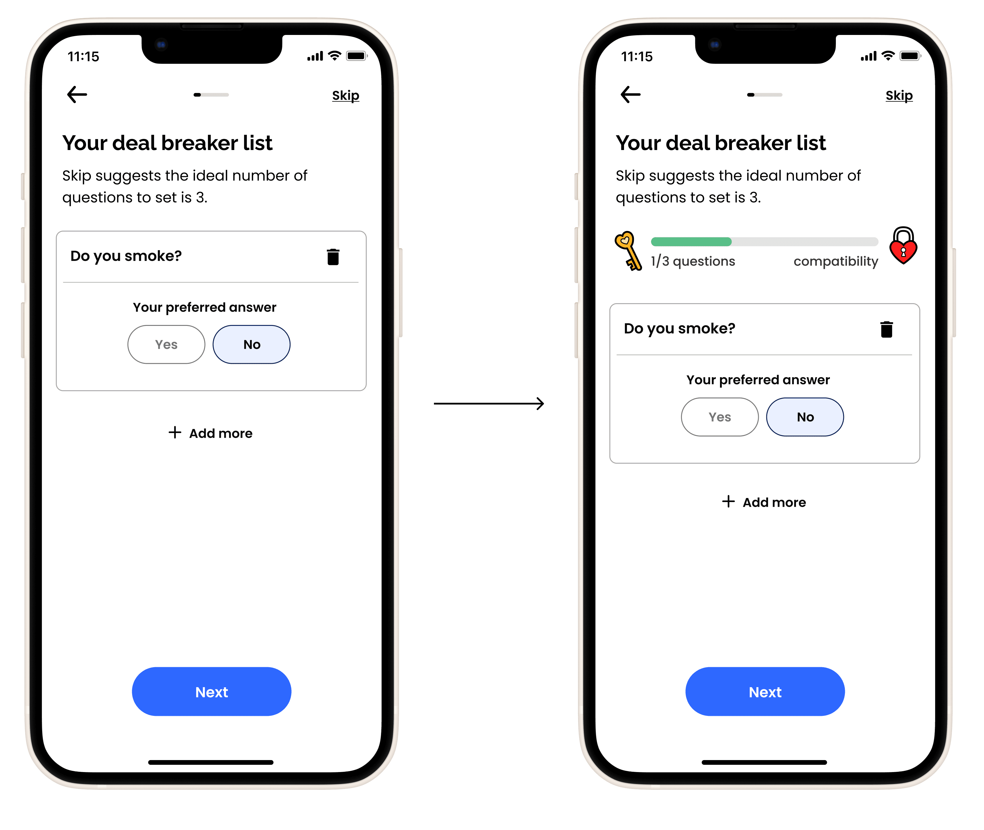
Option B, but gamified
I fully embraced the feedback provided, yet I sought to enhance user understanding regarding the optimal utilization of deal-breaker questions. So I proposed integrating gamification elements to demonstrate how the process really clicks.
Gamifying the process
Boosts user engagement
Visualizes progress toward goals
Clearly communicates benefits and Skip's value proposition
My Design Impact
Ideated and launched deal-breaker question features.
Validated design decisions with stakeholders and optimized the MVP based on feedback.
15,573
# of users who added deal-breaker questions
Nationwide Launch results 1/1/2024 - 2/23/2024
Opportunity #3
Before swiping begins, show how Skip works, not tell
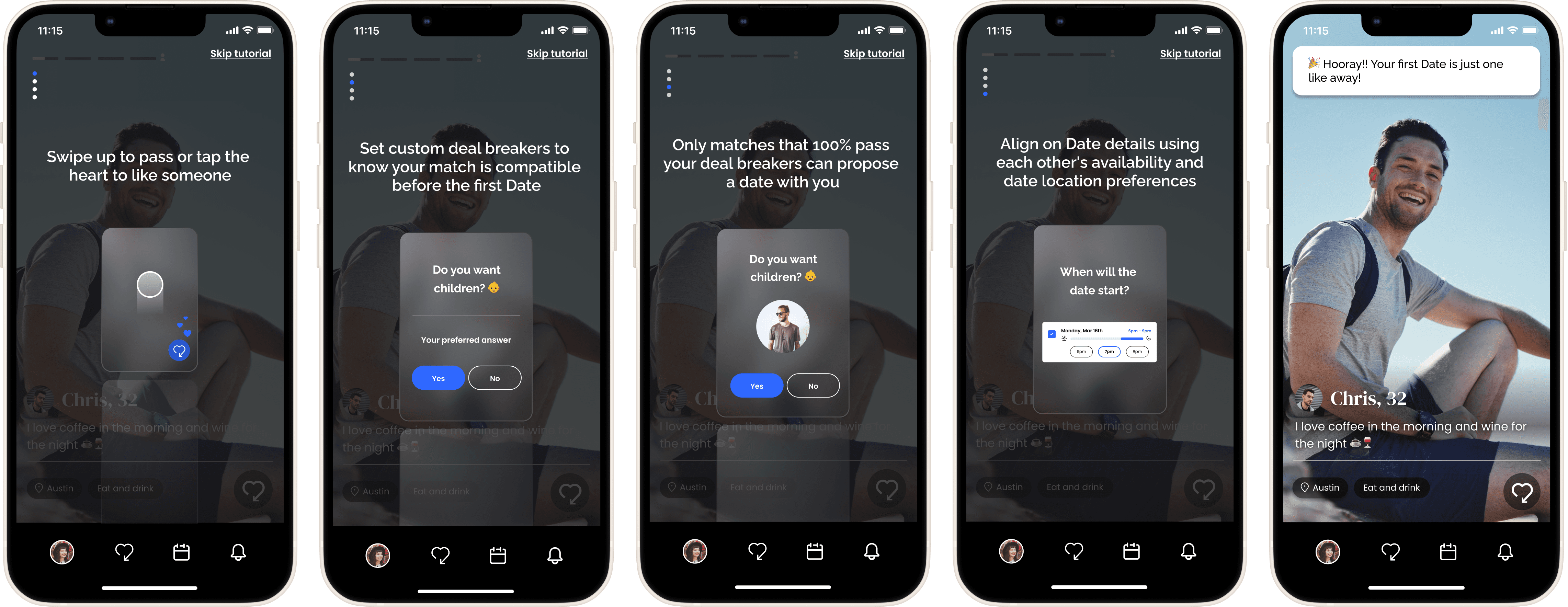
Instructional overlay that users can interact with by just swiping
This interactive tutorial empowers users with mastery over the app's core features. Given users are already in the mindset of swiping, I have leveraged this feature to enhance user engagement and minimize perceived effort.
My Design Impact
Focused on showing only essential user tasks to reduce cognitive load.
Implemented a 'Skip (literally) tutorial' button to avoid overwhelming users.
Utilized existing UI elements in the tutorial to increase user familiarity.
